Pilar Rojo about this year’s visual identification [interview]
![Pilar Rojo about this year’s visual identification [interview]](/upload/8943ff3f69f4b577d0007ee6ad7cf85f_wide.jpg)
How do you feel looking at the effects of your many-months’ work, which are now present on the streets of Krakow?
I am very happy that I managed to bring to reality my crazy idea for this year’s identification! But I’m a bit sad, too, that this is it and that I won’t be getting tens of e-mails a day :)
What gave you the most satisfaction?
It’s the fact that I manged to prepare visual identification which is not a commercial promotional material, but a personal vision, a sort of “additional” exhibition in the festival’s program.
How did you come to this effect – considering your great artwork from 2014, using the optical illusion, and the even better, hand-painted one from last year?
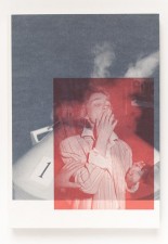
Each year, I try to design artwork which will tell a story about the leading theme of the Photomonth. This year’s edition whose theme is “Crisis? What crisis?!” is mainly devoted to the manners of storytelling, which makes it an experiment at a level of presenting photography. I decided to join this process by using the language of design.
For the posters, you have used the photographs of all artists taking part in the festival. How did the whole process go?
It was quite complex, mainly because of copyright. I carefully picked photographs made by the invited artists, and combined them into collages. In fact these are new pieces of art, so – as usually in such cases – question arises about the authorship, which itself is an interesting issue. Besides, this matter refers to some other projects presented during the festival. In this case, I mainly wanted to involve the artists into cooperation in creating the identification. Note that this year many photography collectives have their exhibitions in the program. This is what I expected, such a collective work. I also wanted to create liaisons between them, which was all the more interesting, that they hadn’t met before.
And how did they react to such a way of working?
They liked it! They appreciated the idea and were willing to cooperate. Frankly speaking, I was horrified at the beginning. In usual practice a designer doesn’t temper the source material to such an extent – and in this case the material in question were completed images. So at the very outset I explained that I was less interested in their individual concepts of the titular ‘crisis’, but rather in creating new mutations, links, and meanings. And, to my relief, the artists responded with great openness and were great and active partners in this discussion.

Tell us about the technical side of the identification.
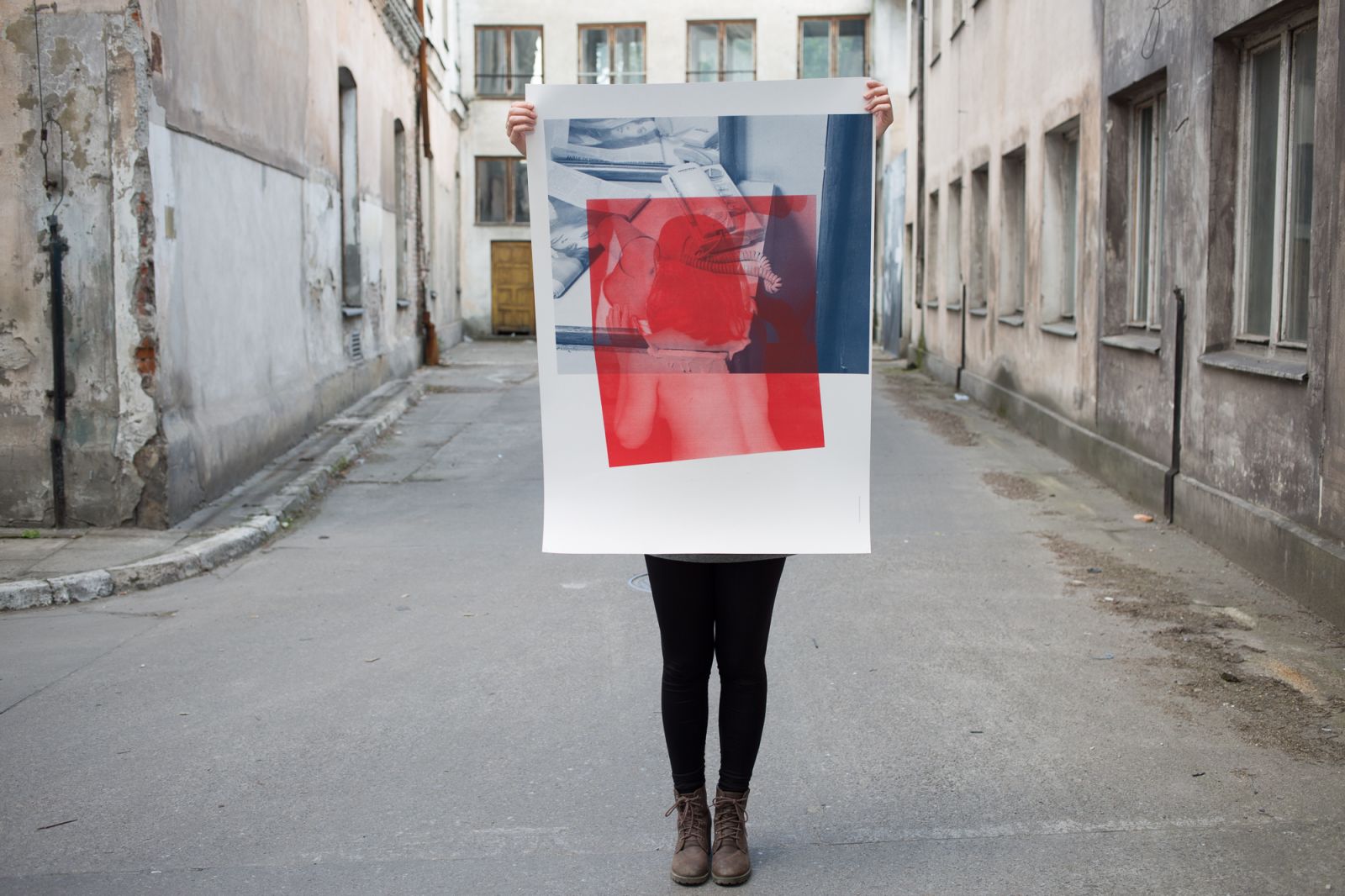
For making the collages I used one photograph from each exhibition, as I wanted all of them to be represented. Then I tried to find connections between them so that they - altogether – would build entirely new meanings. Some of the pictures were used only once, some of them many times in various versions. At the visual level, each photograph has been rendered in one of two colours: light red or dark navy blue, and each collage is composed from 2 to 4 pictures. In total 17 poster designs were created, but some of them bear only the text, i.e. the title “Crisis? What crisis?!” or a part of it.
So the printer was not excessively happy?
It was not easy at all (laugh). We used two pantones and as many as 14 printing plates which were used several times in various configurations. If the collage was composed of more than 2 photographs, a repeated passage through the machine was required. Sometimes we changed the plate between columns, i.e. one photograph was rendered in one colour, and after that – in another. Small number of copies was also a problem – from 25 to 50 copies of each of the 17 posters. The print itself takes seconds while changing plates and preparing the printer – long minutes. But who doesn’t like spending nights in the printing house? :) Fortunately the printer operators joined us in our game – in their everyday routine there not much space for such crazy actions.
So, how will the posters be displayed?
As compositions. There is no one main poster, they are always displayed in a group, and in each location the posters are arranged slightly differently. Sort of a collage made of collages.
Will it be possible to take such a poster home?
Yes! Bearing the collectors in mind, I created a limited edition of two posters (30 pieces of each), made in a manual screen print technique. They are available for viewing and buying in the Festival Centre.
Everything is now printed and installed, what are you going to do now?
First of all I will celebrate the festival with the whole team of the Krakow Photomonth, and in particular with my precious partner, Nina Gregier. Then, I think I’m going to have a long long holiday! :)